
 Digital Nordic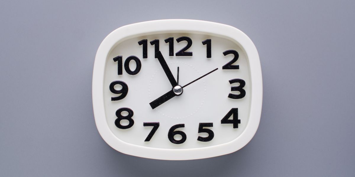
A WordPress website can have a strong offer, clean design, and useful content, but visitors still need a clear reason to act. Many people browse a page, feel interested, and still leave without completing the next step. They may plan to come back later, compare options, or simply forget about the offer. Countdown timers help reduce that hesitation by making the deadline visible.
A countdown timer shows visitors that an offer, launch, registration, or promotion is connected to a specific time limit. Instead of using vague wording like “limited time only,” the timer gives a clear visual reminder of how much time remains. This can make the campaign feel more focused and easier to understand.
For WordPress website owners, countdown timers can support many goals. They can be used for flash sales, WooCommerce discounts, product launches, webinar registrations, event reminders, course enrollment, seasonal promotions, and limited-time bonuses. The timer helps turn attention into action by making timing part of the visitor experience.
A simple countdown timer for WordPress websites can help site owners create urgency without needing a complicated custom setup.
Deadlines Make Offers Easier to Understand
A deadline gives structure to a campaign. When visitors know when an offer ends, they can make a clearer decision. Without a deadline, the offer may feel open-ended, which often leads to delay.
For example, a sale that says “save 25% today” is clearer than a general discount with no ending point. A webinar registration page that shows “registration closes in 12 hours” feels more urgent than one that simply says “sign up soon.” A product launch timer builds anticipation because visitors can see exactly when the product becomes available.
Countdown timers make these deadlines easier to notice. They place time directly on the page where visitors are already reading, shopping, or considering the offer.
The timer should always connect to a real campaign. When the deadline is honest, the countdown improves clarity and helps visitors understand what they need to do before time runs out.
Urgency Works Best With a Strong Message
A countdown timer should support the campaign message, not replace it. If the page does not clearly explain the offer, the timer will not be enough. Visitors still need to know what they are getting, why it matters, and what action they should take.
A strong campaign includes a clear headline, a useful offer, a visible call to action, and a deadline that makes sense. The timer adds urgency to that structure. It reminds visitors that the opportunity is temporary.
For an online store, the message may focus on a sale or free shipping deadline. For a course creator, it may focus on enrollment closing soon. For a service business, it may highlight limited consultation availability. For an event organizer, it may count down to registration closing or the event beginning.
The timer works best when it reinforces the main message and gives visitors a simple reason to act now.
Countdown Timers Can Be Used Across Different Campaigns
Countdown timers are often seen on e-commerce websites, but they are useful for many different types of WordPress sites. Any campaign with a deadline can benefit from a visible timer.
WooCommerce stores can use countdown timers for flash sales, product discounts, limited-time bundles, holiday promotions, and free shipping deadlines. Course creators can use them for enrollment periods, early-bird pricing, and bonus expiration dates. Coaches and consultants can use timers for limited booking windows or application deadlines.
Event websites can count down to ticket sales ending, registration closing, or the event starting. Nonprofits can use timers for fundraising goals or donation deadlines. Local businesses can use them for seasonal promotions, appointment offers, or special events.
The timer helps make the campaign easier to follow. It gives visitors one clear piece of information: how much time is left.
Design Should Fit the Website
A countdown timer should not feel out of place. If the timer design clashes with the website, it can reduce trust. Visitors may see the campaign as rushed or unprofessional. A timer should match the page and support the overall design.
The colors, spacing, typography, and size should feel consistent with the website. A professional service business may want a simple, clean timer. A product launch page may need a bold, modern style. A WooCommerce sale may use a more noticeable layout, but it should still look polished.
The numbers should be easy to read. The labels for days, hours, minutes, and seconds should be clear. The timer should not overpower the offer, hide the button, or make the page feel crowded.
Good design helps the timer feel like a natural part of the campaign instead of a random add-on.
Mobile Responsiveness Is Important
Many visitors view WordPress websites from mobile devices. A countdown timer that looks good on desktop but breaks on mobile can hurt the user experience. If the timer is too wide, too small, or difficult to read, visitors may leave before taking action.
A responsive timer should adjust properly on different screen sizes. The digits should remain clear. The labels should not overlap. The timer should not create horizontal scrolling or push important content too far down the page.
This matters especially for sales pages, product pages, and landing pages. Mobile visitors often make quick decisions. If the timer is easy to read and the call to action is easy to tap, the campaign has a better chance of converting.
Before launching a campaign, website owners should always check how the timer appears on desktop, tablet, and mobile.
Fixed Timers Are Good for Shared Deadlines
Fixed countdown timers count down to one specific date and time. These are useful when every visitor should see the same deadline. Public promotions often use fixed timers because the campaign ends at the same time for everyone.
Examples include holiday sales, Black Friday offers, event registration deadlines, product launch dates, webinar start times, and seasonal campaigns. The timer helps visitors understand exactly when the opportunity ends or begins.
The page should clearly explain what happens when the timer reaches zero. Does the discount end? Does registration close? Does the product become available? Does the bonus expire? The meaning of the timer should be obvious.
Fixed timers work best when the deadline is real and the campaign follows through. This protects trust and keeps the website experience professional.
Evergreen Timers Help Automated Campaigns
Evergreen countdown timers are useful for automated campaigns where each visitor receives a personal deadline. Instead of counting down to one public date, the timer begins based on the visitor’s action or first visit.
This can work well for email funnels, lead magnet offers, automated sales pages, special discounts, and personalized bonuses. For example, a visitor may sign up for a free resource and receive a special offer that expires in 48 hours. An evergreen timer can show that deadline when they visit the offer page.
Evergreen timers are helpful because they allow campaigns to run continuously. The business does not need to manually restart the offer every week. Each visitor gets a timed experience based on when they enter the funnel.
The deadline should remain consistent. If the timer resets too easily, the urgency can feel false. A good evergreen campaign protects credibility by keeping the offer timing reliable.
Expiry Actions Keep Campaigns Clean
A countdown timer should have a clear plan for what happens after it reaches zero. If the timer expires but the same offer remains visible, visitors may feel confused or lose trust. Expiry actions help create a better campaign flow.
Some websites may hide the offer after the timer ends. Others may display an expired message, redirect visitors to another page, remove a button, or replace the promotion with a new section. A webinar page may send visitors to a replay or waitlist. A course page may show that enrollment is closed. A product launch page may change from “coming soon” to “available now.”
Expiry actions make campaigns easier to manage. They also help keep the website accurate after the deadline passes.
A complete countdown campaign should include what visitors see before, during, and after the timer ends.
WooCommerce Stores Can Use Timers for Better Promotion Visibility
WooCommerce stores often run time-sensitive offers. Countdown timers can make those offers easier to notice and understand. A timer can support product discounts, flash sales, limited-time bundles, free shipping deadlines, seasonal sales, and product launches.
Placement matters. If the timer is promoting a product discount, it should appear near the product details or purchase button. If it supports free shipping, it may fit better near the cart or checkout message. If it promotes a storewide sale, it may work well in a banner or sale landing page.
The timer should connect clearly to the offer. Visitors should know what the deadline applies to and what action they need to take.
Timers should not be overused. If every product always has a countdown, the urgency may feel less believable. They work best when connected to real promotions.
Shortcodes Make Placement Easier
WordPress users often need flexible placement options. A countdown timer may need to appear in a landing page, homepage section, sidebar, blog post, product page, or promotional banner. Shortcodes make this easier because they allow users to place the timer without editing complex code.
This flexibility helps website owners launch campaigns faster. They can create the timer, copy the shortcode, and place it where it supports the offer best.
Different campaigns may need different placements. A webinar timer may belong near the registration form. A WooCommerce timer may fit near the product price. A product launch timer may work best near the headline. A blog promotion may include the timer inside the article.
Flexible placement makes countdown timers more useful because the timer can appear exactly where visitors are making decisions.
The Call to Action Should Be Clear
A countdown timer creates urgency, but the call to action tells visitors what to do next. If the timer is visible but the button is hard to find, the campaign may lose conversions.
The action should match the campaign goal. For an online store, it may be “Buy Now” or “Add to Cart.” For a webinar, it may be “Register Today.” For a course, it may be “Enroll Now.” For a service business, it may be “Book a Consultation.”
The timer and button should work together. The timer explains the deadline, while the button gives visitors a path forward. The message around both elements should be simple and direct.
A strong campaign makes the offer, deadline, and action clear within a few seconds.
Testing Helps Improve Results
Countdown timers can be tested like other marketing elements. Website owners can try different placements, styles, messages, and timer types to see what performs best.
A timer near the headline may work well for one campaign, while another campaign may need the timer near the pricing section or button. A bold design may work for a sale, while a cleaner design may fit a professional service page. The wording also matters. “Sale ends in” feels different from “Registration closes in” or “Bonus expires in.”
Website owners can review clicks, sales, signups, bookings, and form submissions to understand whether the timer is helping. They can also watch for issues such as higher bounce rates or lower engagement.
Testing helps improve the campaign without guessing.
Honest Urgency Builds Trust
Countdown timers should always be used honestly. Visitors can lose trust if a timer feels fake, resets every time they return, or promotes an offer that never really ends. False urgency may create short-term pressure, but it can damage credibility.
A good countdown timer supports a real deadline. It helps visitors understand when a sale ends, when enrollment closes, when a bonus expires, or when an event begins.
Honest urgency improves clarity. It does not trick visitors. It simply makes the timing easier to understand.
Trust matters because visitors are more likely to act when they believe the website is reliable. A timer should support that trust, not weaken it.
EZ Countdown Timer Helps WordPress Sites Add Clear Urgency
Countdown timers can make WordPress campaigns more focused, timely, and conversion-friendly. They help visitors understand the deadline and make the next step easier to take. Whether the goal is to promote a sale, launch a product, register attendees, or create urgency around a limited-time offer, a timer can support the campaign.
EZ Countdown Timer gives WordPress website owners a practical way to add countdown timers to pages, posts, WooCommerce promotions, and marketing campaigns. With the right setup, timers can support real deadlines, flexible placement, responsive design, and stronger calls to action.
The best countdown timers are clear, honest, mobile-friendly, and connected to a strong offer. They do not replace good marketing, but they make timing more visible.
When used properly, countdown timers help turn campaign deadlines into meaningful action.